Photo Style Guide

Environment
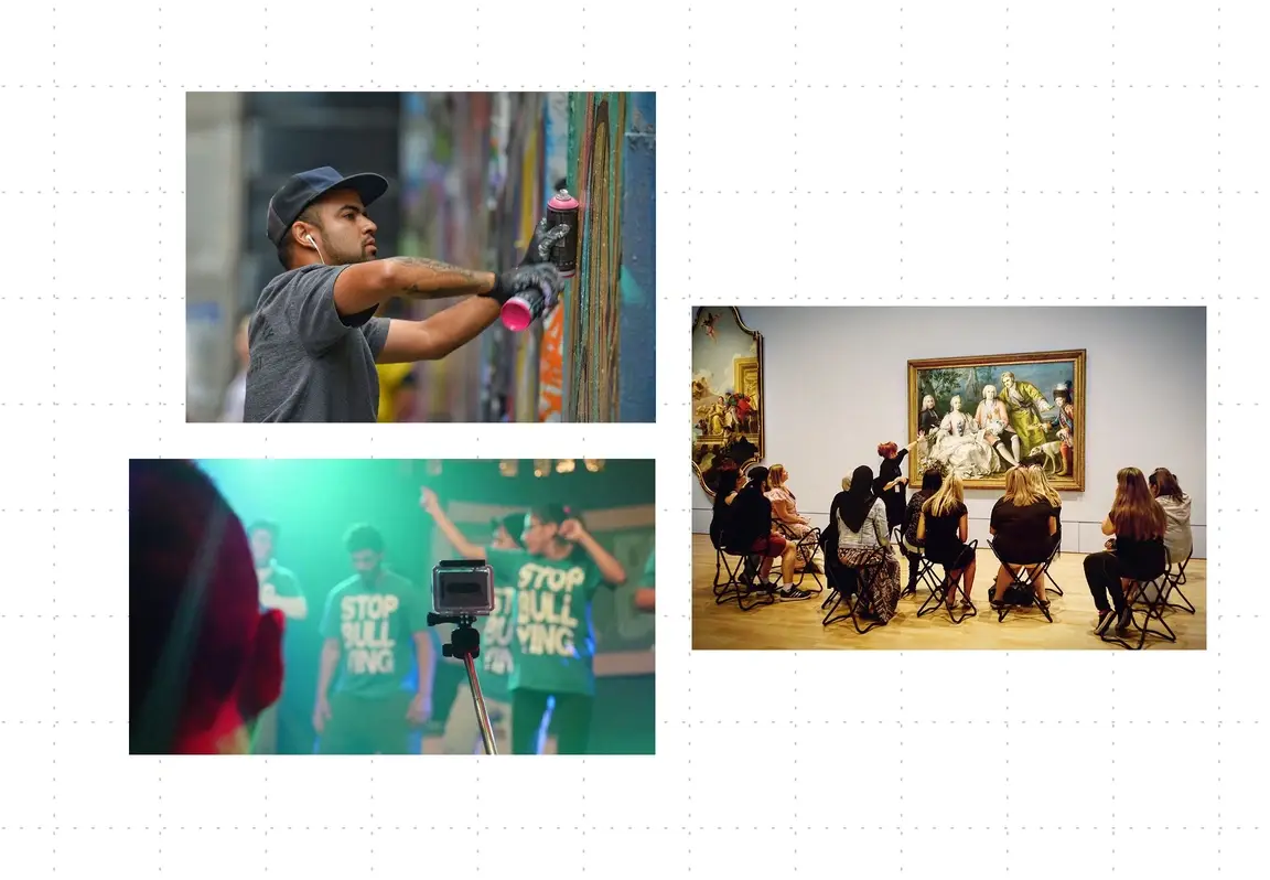
We are sharing the most exciting listings around, so let's infuse that energy into our photography choices. Many of our jobs and actions are out of the office and in the field, giving us the opportunity to show people working outside or interacting with community.

Color
Whenever possible, use high-saturation images that include notes of our brand colors: yellow, blue and green. Avoid all image filters that dull the image.

Collaged Photography
We get it, the perfect photo does not always exist. When using low resolution images, try placing it on a textured paper background and adding a pop of brand color. If using a bland stock photo, try collaging some illustrative elements to the background.


Careers
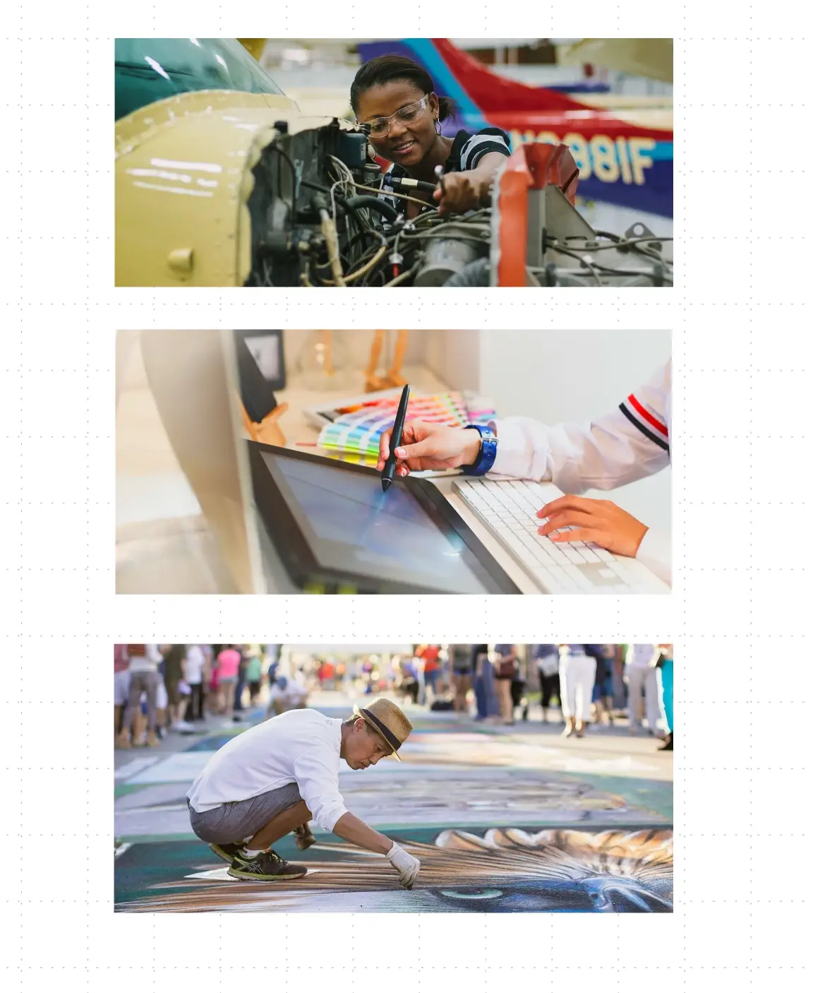
When choosing images remember that social impact work can be active and does not always take place 9 to 5. Photos are more engaging and inclusive when they show a range of work environments.
Blog Banners
Blog post feature images (above the scroll) can be more limiting than inline images. We recommend choosing pictures that have a bold color palette and texture. Images with too much white will blend into the page and are difficult to read. It is also best practice use a bit of tease in the image, opting for a more poetic or nuanced illustration of the content.


